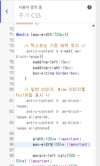
데스크탑 환경에서는 크게 상관없지만, 모바일 환경에서 이미지를 볼 때 좌우 측면에 여백이 생기는 것을 그다지 좋아하지 않는다. 특히 이미지가 이 여백 padding 으로 인해 이미지가 작게 보인다는 점이 항상 신경 쓰였다.
그래서 간단하게 720px 미만, 혹은 모바일 환경에서 워드프레스 웹 페이지를 열었을 때 이미지의 padding 을 없애주는 CSS 스타일이다.
워드프레스를 통해 이미지를 주로 전시/공유하는 사용자에게는 사용자 친화성/편의성을 높여준다는 약간의 장점이 있을 것으로 보인다. 어디까지나 자기만족이라 할 수 있는 코드이다.
모양(테마) – CSS 에서 추가하면 된다.
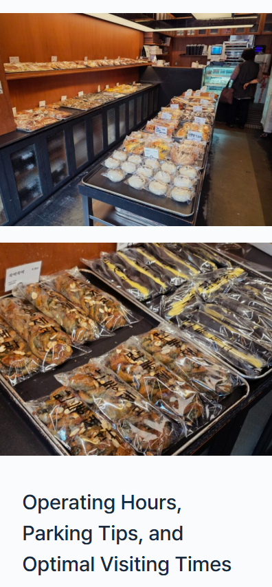
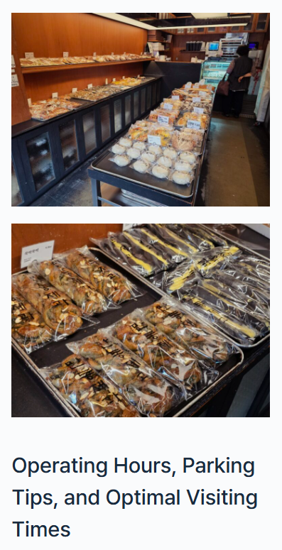
좌측이 적용, 우측이 미적용한 이미지이다. 차이를 크게 못 느낄 수도 있다.
여백만큼 이미지를 채웠느냐, 아니냐의 차이이다.
/* ===========================================
   Blocksy + Gutenberg
   모바일(720px 이하)에서 이미지를 전체 폭으로 표시
   =========================================== */

@media (max-width:720px){

    /* 텍스트는 기존 여백 유지 */
    .entry-content > *:not(.wp-block-image){
        padding-left:16px;
        padding-right:16px;
        box-sizing:border-box;
    }

    /* 일반 이미지, Wide 이미지를 Full처럼 표시 */
    .entry-content > .wp-block-image,
    .entry-content > .wp-block-image.alignwide,
    .entry-content > .wp-block-image.alignnone{

        width:100vw !important;
        max-width:100vw !important;

        margin-left:calc(50% - 50vw) !important;
        margin-right:calc(50% - 50vw) !important;

        padding:0 !important;
    }

    /* 이미지 자체 */
    .entry-content > .wp-block-image img{

        display:block;
        width:100% !important;
        max-width:none !important;
        height:auto;

        margin:0;
        padding:0;
    }

    /* Full 이미지는 그대로 유지 */
    .entry-content > .wp-block-image.alignfull{

        width:100vw !important;
        max-width:100vw !important;

        margin-left:calc(50% - 50vw) !important;
        margin-right:calc(50% - 50vw) !important;
    }

}